Literati Black Pine
5 posters
Page 1 of 1
 Literati Black Pine
Last edited by peter keane on Sat Jan 15, 2011 6:49 pm; edited 2 times in total (Reason for editing : needed more information)
peter keane- Member
 Re: Literati Black Pine
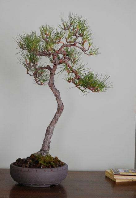
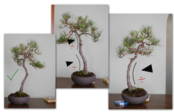
I like the third picture with the little jin showing. Great tree love the base and the taper thanks for posting.

Neil Jaeger- Member
 Re: Literati Black Pine
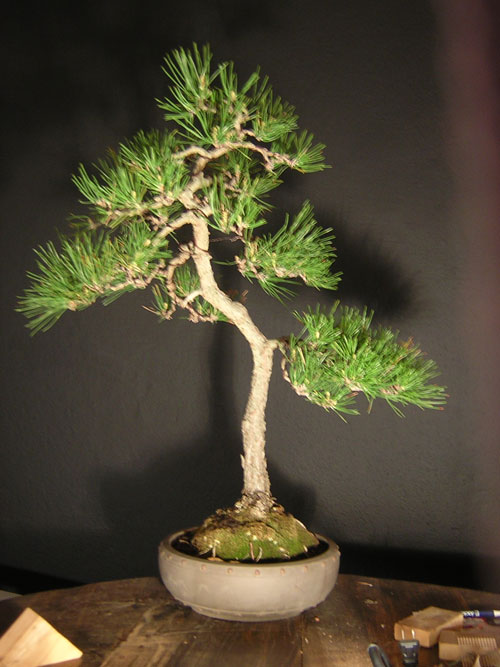
From what the pictures can tell. the second is the best with a good 3D feel to the tree. the third picture it seems that the tree is leaning away from the viewer.
Luc
Luc
luc tran- Member
 Re: Literati Black Pine
Peter, I like your tree and have looked at the photos a few times. This tree is challenging. I like the tension that the third photo shows, but the roots do not support the tree at that angle. The first and third photo - the roots support the lower trunk. I would have to see a 360 before making a decision. What are your thoughts at this point? I think removing the first branch like you did was a good start. Have fun!
Best,Todd
Best,Todd
Last edited by Todd Ellis on Sun Jan 16, 2011 1:39 pm; edited 1 time in total (Reason for editing : spelling)
Todd Ellis- Member
 Re: Literati Black Pine
The first photo for me. got the best trunk movement. just keep the second branch on the right side and grow it a bit longer ,the back branch on the middle portion and the branch with top canopy...If it were my tree I'll remove the rest of the branches to have a true literati simplicity.
regards,
jun
regards,
jun
Guest- Guest
 Re: Literati Black Pine
wow. after reading the comments, you guys have me thinking....... While studying the tree for purchase, the first image was what I intended for the final design. However, yesterday, I wanted to play with different angles and trunk lines as "what if's".....
As dramatic as the first image is, the things that bother me about it are these: the movement of the trunk is too abrupt. To me, a bunjin should have a gentle flow to it. I don't like the "knee" at (2). The trunks at (3) and (4) are near vertical and horizontal, feeling "static". Additionally, from the soil to the apex, the trunk is two-dimensional - which can't be seen in this photograph. Luc was able to see that in the 3rd image, the apex went backwards.
In the second option, the trunk line is a series of "c" curves, breaking the rules. I don't mind the curves as the trunk line has a nice visual rythmn. There are plenty of examples of trees in nature (and european exhibitions) that have the dreaded "c" curve. The trunk is also three-dimensional in this image (which is hard to see). The 1st part of part of the trunk comes towards the viewer before (2) starts. Although the apex moves towards the wall in (3), it can be bent clockwise to come back to the viewer. This is what I had chosen for my final design.
I may have to graft a shoot at the base of the second branch to develop a compact pad. I'll see how it looks after wiring it out. Thanks guys....


peter keane- Member
 Re: Literati Black Pine
What rules are broken? There are no rules. Just look and decide what looks most natural. As Jun writes, you need the canopy to be light and not too dense. Therefore no need to graft. Keep the foliage pads open and not too heavy as it seems natural supported by the slim trunk.
Regards
Morten
Regards
Morten
Guest- Guest
 Re: Literati Black Pine
morten albek wrote:What rules are broken? There are no rules. Just look and decide what looks most natural. As Jun writes, you need the canopy to be light and not too dense. Therefore no need to graft. Keep the foliage pads open and not too heavy as it seems natural supported by the slim trunk.
Regards
Morten
This is a classic example of following to much "rules" will make your tree unnatural. Please don't make the easy portion more difficult. Just pull the second branch down further to make the tree looks older. branches right now are over crowded.
regards,
jun
Guest- Guest
 literati black pine
MY OPION,,,I like the first view..The bottom back branch bothers me a little..is there not another one highter up??? pull the branches down a little is what i would do....nice tree!! TAKE CARE JOHN
moyogijohn- Member
 Re: Literati Black Pine
I just feel that this tree is very feminine and I personally think that the second photo with the 'c' curves display this feminie side the best. I'm excited as to how you work with the tree. Keep us posted.
Luc
Luc
luc tran- Member
 Similar topics
» Literati Black Pine from Australia
» Literati Scots Pine
» Literati Pine
» Trees downunder in training.
» Scots pine literati
» Literati Scots Pine
» Literati Pine
» Trees downunder in training.
» Scots pine literati
Page 1 of 1
Permissions in this forum:
You cannot reply to topics in this forum


