


Autumn Accent
4 posters
Page 1 of 1

 Autumn Accent
![]() Peter E. Wed Aug 13, 2014 10:02 pm
Peter E. Wed Aug 13, 2014 10:02 pm
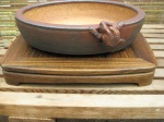
I have been playing around with displaying accents.
How about this one, ?

Gunnera magellancia.
Displayed on a ceramic Jitta from Dan Barton.
Scroll shows migrating geese to indicate season.
How about this one, ?
Gunnera magellancia.
Displayed on a ceramic Jitta from Dan Barton.
Scroll shows migrating geese to indicate season.
Peter E.- Member

Re: Autumn Accent
![]() Jeremy Fri Aug 15, 2014 10:43 am
Jeremy Fri Aug 15, 2014 10:43 am
Hi Peter,
Thank you for posting.
I like your seasonal display. Good to see displaying practices are becoming more thoughtful.
I do feel the picture angle and the framing detracts a little from fully appreciating your work.
You could try stepping back a little, zooming out a little to create the feeling of space further.
Also, perhaps using the kakemono as the centre, giving the asymmetry more emphasis.
Personal exploration is the name of the game. Great to watch you and others explore their ideas.

Jeremy- Member
Re: Autumn Accent
![]() dick benbow Fri Aug 15, 2014 2:22 pm
dick benbow Fri Aug 15, 2014 2:22 pm
I really like the challenge of display, so glad you chose to post something that we could have a back and forth on  I too am learning and no pretender of being an expert. But I'm putting a lot of time into it, focused on trying to learn more of the less obvious ways of doing things.
As I look at the main subject I would like to see it lifted up, on maybe a low display Table of sorts, so that I could see a glimpse of it's pot Having the leaves drape down to the mat takes away from my conviction that the bonsai subject and pot are paired together properly. In a way a passing assurance.
While i can accept the theme of migration on your scroll to set the theme, I wonder why the use of blue in your scroll, which seems to me to indicate more of a subtle suggestion of water. To me, fall colors would be more of an orange or brown maybe red.For this time of year, I had my friend and sumi-e artist, Hiroko, make me a shikishi board with a rather large spider dangling from it's web thread. As I try to learn from nature, I see this time of year, more spiders seem to be spreading their webs everywhere. And they're growing in size (scary thought walking into them). I mention this because I think it so hard to be conscious of small subtleties for people to pick up on than stating the obvious. With the onset of fall, indicated by the spiders, by this time next month many will be killed by the advent of first frost and their food supply done away with as well.
These comments are not made as anything critical of your effort, but something i wanted to pass along as we look more intently on the deeper less obvious suggestions transported in the content of our display.
dick benbow- Member
Re: Autumn Accent
![]() dick benbow Fri Aug 15, 2014 4:22 pm
dick benbow Fri Aug 15, 2014 4:22 pm
back to the scroll. here the Pacific Northwest, fall can be a pretty good period of heavy rains. A shikishi board of a heavy flow waterfall would be appropriate for fall and the blue background of the scroll enforcing that environment. maybe a tenpai of a squirrel with nut in hand would suggest a fall theme, as opposed to heavy rains here in the spring, where a pair of nesting birds would give more direction to spring seasonality.
I learned from those who studied in Japan, that fall color can be advanced by planning which trees or bonsai subjects you wish to display and then placing them in a controlled environment where you can begin cutting down on the amount of light they receive each day. Over 4-6 weeks you can have them convinced that the season ( sensed by them by the amount of light each day) is coming into fruition.
So much to learn, love the chalenge
dick benbow- Member
Re: Autumn Accent
![]() Peter E. Fri Aug 15, 2014 8:18 pm
Peter E. Fri Aug 15, 2014 8:18 pm
Thanks for the pointers Jerry. I will try harder. 
Dick, i will take your points on board as well.
The blue scroll was to indicate water and the geese also tied the water with Autumn.
I have tried your suggestion of a waterfall.
Unfortunately, the waterfall flows in the same direction as the accent so I had to introduce a third element to stop your view leaving the scene.
I had also been told that you should not use two matching elements in one design, i.e. blue water / waterfall.
I do like the plant raised on a table.
I also trimmed some leaves to show some of the pot.
Overall, I prefer the two element display as it is a more simple design.

Grateful for more input.
Dick, i will take your points on board as well.
The blue scroll was to indicate water and the geese also tied the water with Autumn.
I have tried your suggestion of a waterfall.
Unfortunately, the waterfall flows in the same direction as the accent so I had to introduce a third element to stop your view leaving the scene.
I had also been told that you should not use two matching elements in one design, i.e. blue water / waterfall.
I do like the plant raised on a table.
I also trimmed some leaves to show some of the pot.
Overall, I prefer the two element display as it is a more simple design.
Grateful for more input.
Peter E.- Member
Re: Autumn Accent
![]() Jeremy Sat Aug 16, 2014 12:59 am
Jeremy Sat Aug 16, 2014 12:59 am
Hi Peter,
Good to see it evolve further.
In the 3 pointer, just a small point, I'd try and use a different colour and shape for one of the stands. They are to my eye too similar. A free form jita in a darker wood I feel would work and give the display a more restrained appeal.
I don't feel you need the formal jita under the accent table. A table for a table over eggs the pudding.
I felt the geese tanzaku worked better seasonally. The waterfall seems to me to be cooling and better suited for a Summer display. What is the seasonal reference of the 3rd element?
Could you face the Gunnera the other way in a 2 point display, would that work? Less is more. The 3rd element to my eye is redundant, as it, to my eye, add nothing that is not already present, but is a distraction.
The blue background would I feel work better in a summer display. What colour would you feel suits Autumn? Browns, reds, ochre, Autumnal colours.
A 2 point display, geese tanzaku on a autumnal board/scroll with the accent, either offset, or squarely under the central kakemono, refined, restrained and reserved. Think I'll give that a try myself.
Good to see it evolve further.
In the 3 pointer, just a small point, I'd try and use a different colour and shape for one of the stands. They are to my eye too similar. A free form jita in a darker wood I feel would work and give the display a more restrained appeal.
I don't feel you need the formal jita under the accent table. A table for a table over eggs the pudding.
I felt the geese tanzaku worked better seasonally. The waterfall seems to me to be cooling and better suited for a Summer display. What is the seasonal reference of the 3rd element?
Could you face the Gunnera the other way in a 2 point display, would that work? Less is more. The 3rd element to my eye is redundant, as it, to my eye, add nothing that is not already present, but is a distraction.
The blue background would I feel work better in a summer display. What colour would you feel suits Autumn? Browns, reds, ochre, Autumnal colours.
A 2 point display, geese tanzaku on a autumnal board/scroll with the accent, either offset, or squarely under the central kakemono, refined, restrained and reserved.
Jeremy- Member
Re: Autumn Accent
![]() dick benbow Sat Aug 16, 2014 2:15 pm
dick benbow Sat Aug 16, 2014 2:15 pm
I think one of the most frustrating parts of display for me, is my lack of appropriate shikishi art, appropriate tenpai and kusamono.
Tho I work at collecting, it seems i never have what I need. kinda reminds me of my pitiful bonsai pot collection. Tho enormous, when it comes to needing something specific, it seems I must go out and search for something new that I don't have....
Tho I work at collecting, it seems i never have what I need. kinda reminds me of my pitiful bonsai pot collection. Tho enormous, when it comes to needing something specific, it seems I must go out and search for something new that I don't have....
dick benbow- Member
Re: Autumn Accent
![]() Jeremy Sat Aug 16, 2014 7:05 pm
Jeremy Sat Aug 16, 2014 7:05 pm
Oh yes, I've been there.dick benbow wrote: I think one of the most frustrating parts of display for me, is my lack of appropriate shikishi art, appropriate tenpai and kusamono.
Tho I work at collecting, it seems i never have what I need. kinda reminds me of my pitiful bonsai pot collection. Tho enormous, when it comes to needing something specific, it seems I must go out and search for something new that I don't have....
The journey is half the pleasure. I am trying to gather British originated and local items to use within my display practices.
Jeremy- Member
Re: Autumn Accent
![]() dick benbow Sun Aug 17, 2014 4:35 pm
dick benbow Sun Aug 17, 2014 4:35 pm
Speaking of british, do you have Paul Goff's book on display. nicely done and he addresses local celebrations and their coverage in display. One of my favorites
Tracing my roots, takes me back to the UK and so even in bonsai, I have made a concerted effort to acquire pots from there. I have to name a few, a half dozen aspinal pots, along with my favorite Toad pot from Dan Barton
Tracing my roots, takes me back to the UK and so even in bonsai, I have made a concerted effort to acquire pots from there. I have to name a few, a half dozen aspinal pots, along with my favorite Toad pot from Dan Barton
dick benbow- Member
Re: Autumn Accent
![]() Jeremy Sun Aug 17, 2014 8:54 pm
Jeremy Sun Aug 17, 2014 8:54 pm
Hi,dick benbow wrote:Speaking of british, do you have Paul Goff's book on display. nicely done and he addresses local celebrations and their coverage in display. One of my favorites
Tracing my roots, takes me back to the UK and so even in bonsai, I have made a concerted effort to acquire pots from there. I have to name a few, a half dozen aspinal pots, along with my favorite Toad pot from Dan Barton
Yes Paul's book is a major step forwards.
I spent a weekend with Paul recently.
http://europeanbonsai.com/viewtopic.php?f=9&t=2027
Very good and unique day.
Jeremy- Member
Re: Autumn Accent
![]() Andre Beaurain Wed Aug 20, 2014 9:11 am
Andre Beaurain Wed Aug 20, 2014 9:11 am
Peter E. wrote:
.
This is much better.
But for me everything is to far form each other.
There is to much negative space. And then the space becomes elements themselves, and the scene is then to busy.
The scroll is to small for the acccent. But maybe if you move everything closer it will seem bigger.
I love the colour play!
Love and light

Andre Beaurain- Member
dick benbow- Member
Re: Autumn Accent
![]() Peter E. Wed Aug 20, 2014 5:32 pm
Peter E. Wed Aug 20, 2014 5:32 pm
Thanks for you view Andre.
I did not want the scroll to dominate the display so used the small one.
I will try a tighter setting.
I did not want the scroll to dominate the display so used the small one.
I will try a tighter setting.
Peter E.- Member
Re: Autumn Accent
![]() Jeremy Thu Aug 21, 2014 8:51 pm
Jeremy Thu Aug 21, 2014 8:51 pm
dick benbow wrote:I agree that it could be tightened up
An important part of my display practice is allude to and create the feeling of space.
I aim to allow the individual objects to have as much space between to suit my eye. Usually more than most feel comfortable with.
Peter, I'd suggest you give yourself the time to see what you like and what expresses your feelings and taste.
The more you play, the more your personal influences will be discovered.
Have fun.
Jeremy- Member
» Coleus accent
» Name this Accent Name
» A Little accent
» new accent in a rather new pot
» Small Log Accent
» Name this Accent Name
» A Little accent
» new accent in a rather new pot
» Small Log Accent
Page 1 of 1
Permissions in this forum:
You cannot reply to topics in this forum|
|
|